The quick read — 90 seconds
- The Analysis Tools panel is where interpretation lives. The plan view updates automatically; everything else (cross-sections, water balance, 3D views, charts) is one or two clicks away.
- Head contours on the plan view should converge along rivers and lakes (they drain groundwater) and diverge from ridges (they recharge). Close contour spacing means steep gradient; wide spacing means gentle gradient.
- Velocity vectors point from high head to low head (always perpendicular to contours). Dense long vectors = fast flow; sparse short vectors = slow flow.
- Cross-sections are drawn by clicking two points on the plan view. They reveal vertical structure — water table position, aquifer thickness variations, vertical flow components, plume depth profiles.
- The water balance is the single best model-integrity check. Inflows should equal outflows in a converged steady-state model. Imbalance means something is wrong.
- Monitoring wells produce hydrographs and breakthrough curves — time-series of simulated head and concentration at a specific location, perfect for comparing to observed data.
8.1 The Analysis Tools
All interpretation starts from the Analysis Tools panel — the third of the four main toolbar groups (see Ch. 2 §2.4). A converged simulation activates every tool in the panel; before then, most are grayed out.

| Tool | What it shows | When to use it |
|---|---|---|
| Plan view (automatic) | Head contours and velocity vectors on the map | Always open; the primary interpretation surface. |
| Cross-Section | Vertical slice along a user-drawn line | When vertical structure matters — layered models, vertical flow components, plume depth profiles. |
| Analysis | Multi-panel view: 3D water table, colored head surface, cross-section, plan view | For comprehensive visual inspection or for producing report figures. |
| Water Balance | Tabulated inflows, outflows, and storage change by category | After every significant simulation. Essential model-integrity check. |
| Charts | Time-series at monitoring wells; calibration scatter plots; breakthrough curves | Transient simulations; calibration comparisons; concentration analysis. |
| Statistics | Summary metrics for head, flux, velocity across the domain | Quick quantitative comparisons between models or scenarios. |
| Calibration | Observed-vs-simulated scatter plots with residuals | When comparing to field measurements. Ch. 17 covers this in depth. |
8.2 Reading the Plan View
The plan view is always open — it's the web map, now decorated with your simulation's results. Learning to read it well is the single highest-leverage skill in interpreting IGW-NET results.
8.2.1 Head contours
Continuous lines on the plan view represent lines of equal hydraulic head — the water table, essentially. They behave just like topographic contours, except they show the elevation of groundwater instead of ground surface.
| What you see | What it means |
|---|---|
| Contours converging toward a river or lake | The feature is draining groundwater — baseflow discharge. This is the typical and expected pattern for perennial streams and lakes. |
| Contours diverging from a ridge or hill | The ridge is a recharge zone — water enters the aquifer at the top and flows outward and downward. |
| Tightly spaced contours | Steep hydraulic gradient — fast flow. Typical near pumping wells, leaky rivers, or low-K zones where head must drop quickly. |
| Widely spaced contours | Gentle gradient — slow flow. Typical in the interior of recharge areas and in high-K aquifers where gradients can be gentle. |
| Closed contour loops (bullseye pattern) | A local minimum (around a pumping well) or maximum (around an injection well or isolated recharge zone). |
| Parallel straight contours | Regional groundwater flow with approximately uniform gradient — typical in areas far from discharge features. |
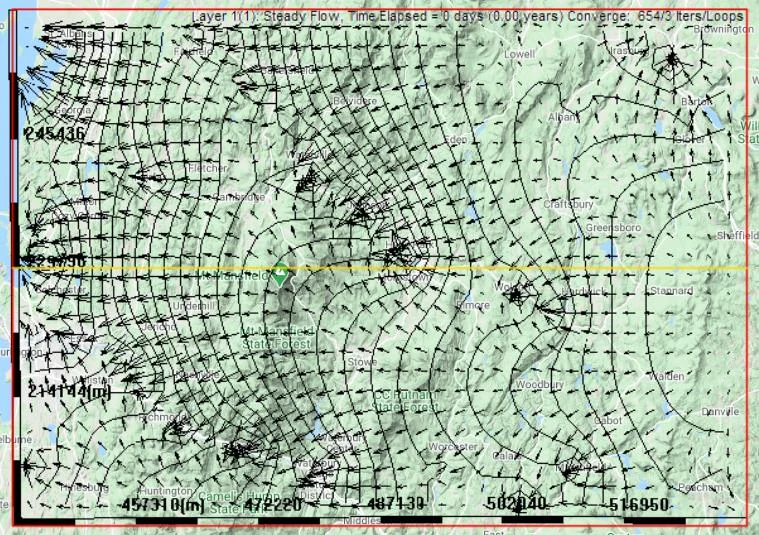
8.2.2 Velocity vectors
The arrows decorating the plan view are velocity vectors — each shows the direction and relative magnitude of groundwater flow at a cell. They always point perpendicular to head contours (from high head to low head).
Vector length is proportional to flow speed. In a typical display, the longest vectors are near pumping wells (fast convergence to the well) or along high-K zones with steep gradients. The shortest vectors are in recharge areas where horizontal flow is slow.
Head contours show where the water is; velocity vectors show where the water is going. In a realistic flow field, these agree: water flows from high head to low head, perpendicular to contours, fastest where contours are closest. If the two visualizations seem to disagree — e.g., dense vectors in an area with widely-spaced contours — something is wrong. Usually it's a display issue (try zooming in or changing the vector density), but occasionally it indicates a numerical problem.
8.2.3 The sanity-check pattern
For any new site, run this mental checklist against the plan view:
- Where are the major rivers and lakes? Contours should converge there.
- Where are the topographic highs? Contours should diverge from them.
- Where are known wetlands or springs? They should be near local lows in the water table.
- Are there any closed contour bullseyes? They should correspond to pumping/injection wells or isolated recharge features.
- Do flow directions match regional intuition? Water should flow from uplands to lowlands, from recharge zones to discharge zones.
If the answer to most of these is "yes," your model is telling you something true about the site. If specific features don't match, those are your refinement targets — the places where adding real data will most improve the simulation.
8.3 Cross-Sections
A cross-section is a vertical slice through the model along a line you draw. It reveals what the plan view hides: vertical structure, layer geometry, and vertical components of flow.
8.3.1 Drawing a cross-section
Click Cross-Section
In the Analysis Tools panel, click Cross-Section.
Click two points on the plan view
The line connecting them defines the cross-section. Click once at one end, move the cursor, click at the other end.
The cross-section window opens
You see a vertical slice showing: aquifer top (land surface or water table), aquifer bottom, computed head along the line, any layers present, and (if transport is active) concentration.

8.3.2 What cross-sections reveal
| Question | Cross-section answers… |
|---|---|
| How thick is the aquifer along this line? | Distance between the aquifer top and bottom at each point. |
| Where is the water table relative to the land surface? | Visible as a separate line when water table differs from DEM top. |
| Is there vertical flow beneath a river or lake? | Vertical flow arrows in sublayered models show downward seepage or upward discharge. |
| How does the plume distribute with depth? | Colored concentration field on the vertical slice. |
| How do layers interact at a site? | Layer boundaries, perforation intervals of wells, and discharge points between layers are visible. |
Don't settle for one cross-section. Two perpendicular slices (e.g., east-west and north-south through your area of interest) reveal much more about 3D structure than either alone. For layered models, a cross-section along the direction of regional flow and one across it give a complete picture of how layers communicate.
8.4 Water Balance — The Sanity Check
The water balance is the single most important interpretive tool in IGW-NET. It is also the single most reliable indicator of whether your model is doing what you think it's doing.
8.4.1 What the water balance reports
Click Analysis → Water Balance. You get a table of inflows and outflows, broken down by category:
| Inflows | Outflows | Storage |
|---|---|---|
| Recharge (distributed rainfall) | Surface drainage (discharge to land surface) | Change in aquifer storage (transient only; zero for steady-state) |
| Injection wells | Pumping wells | |
| Stream losses (two-way streams, where aquifer receives water) | Stream gains (baseflow; drain discharge) | |
| Boundary inflow (specified-head or flux boundaries) | Boundary outflow |
8.4.2 Reading the totals
For a well-constructed steady-state model, inflows should equal outflows, within small numerical tolerance (typically <1% error). The imbalance, if any, is reported as a percent.
| Imbalance | Interpretation |
|---|---|
| < 1% | Healthy. The model is numerically converged and physically consistent. |
| 1-2% | Marginal. Usually acceptable but worth understanding where it comes from — often a fringe convergence issue. |
| 2-5% | Indicates a convergence or configuration problem. Don't rely on this model's specific numbers; tighten tolerance or find the configuration issue. |
| > 5% | Something is seriously wrong. Possible causes: severe non-convergence, a feature with wildly unphysical parameters, or a coding issue worth reporting. Do not interpret results until resolved. |
8.4.3 Using the water balance for physical reasoning
Beyond the imbalance check, the water balance tells you what's driving your model:
- Dominant inflow and outflow categories. In most humid-region base models, recharge is the biggest inflow and stream discharge (drains + gains) is the biggest outflow. If something else dominates — e.g., pumping dominates outflow — it tells you about what the flow system is really doing at your site.
- Stream gains vs losses. In a two-way stream setup, gains exceed losses in humid-climate settings where groundwater baseflow feeds streams. Losses exceeding gains suggests either you're in an arid setting or something is wrong with your stream configuration.
- Boundary fluxes. If boundary outflows or inflows are a significant fraction of the total, your domain may be too small — the boundaries are doing too much work, and your interior flow field may be distorted. Consider a larger domain or explicit boundary condition features.
Every time you make a refinement — add a feature, change K, raise the aquifer bottom — re-check the water balance. The question is never just "does it balance?" (it should, within tolerance). The question is "what changed, and does the change make sense?" A new pumping well should increase the outflow total. A raised aquifer bottom should leave the balance unchanged but tighten convergence. A switch to a more conductive K raster should change the relative balance between boundary flux and internal circulation. This running conversation with the water balance is what makes refinements accountable.
8.5 3D Visualization
The plan view and cross-sections cover most interpretive needs. For certain questions — understanding water-table topography, communicating results to non-technical audiences, or diagnosing complex 3D flow — a 3D view adds real value.
8.5.1 The four-panel analysis view

Click Analysis in the toolbar to open the four-panel view. Each panel shows the same model from a different angle:
- 3D Surface Plot — the water table as a colored relief map. The "topography" of groundwater. Highest where recharge is strongest or aquifer is thinnest; lowest near discharge features and pumping wells.
- 3D Head Surface with Contours — same surface with contour lines overlaid. Useful for reports because it combines intuitive 3D understanding with quantitative contour values.
- Cross-section — the vertical slice you drew; updates as you move the section line.
- Plan view — the traditional map view with contours and velocity vectors.
8.5.2 When 3D really helps
- Communicating to non-technical audiences. A 3D water-table surface conveys "the shape of groundwater" in a way that contour plots don't. Useful in stakeholder meetings, presentations, and outreach.
- Understanding large-scale flow systems. For regional models with complex topography, the 3D view makes divide structure visible at a glance.
- Diagnosing 3D plume migration. For transport simulations with significant vertical components (DNAPL, density-driven, layered systems), the 3D view reveals patterns invisible in 2D.
- Debugging bathymetry or DEM issues. A strange-looking 3D water-table surface often reveals a DEM artifact or bottom-elevation issue you hadn't noticed.
8.6 Charts and Time Series
For transient simulations and calibration work, time-series charts at specific locations are where quantitative interpretation happens.
8.6.1 Hydrographs at monitoring wells
Any well with isMonitoringWell = 1 (Ch. 6 §6.4) automatically produces a hydrograph — a time series of simulated head at its location. In transient runs, you see how head changes over time at that point; in steady-state runs, you see the single steady value.
Hydrographs are essential for:
- Calibration. Overlay observed water-level time series from field monitoring wells on the simulated hydrograph; adjust parameters to improve the match. See Ch. 17.
- Response analysis. How quickly does head recover when pumping stops? How much seasonal variation do you predict? Hydrographs answer these directly.
- Comparing scenarios. Run multiple simulations (different pumping strategies, different climate assumptions) and compare hydrograph outputs at the same monitoring well.
8.6.2 Concentration breakthrough curves
If transport is active and you have monitoring wells downgradient of a source, each monitoring well also produces a breakthrough curve — concentration over time at that well. This is the quantitative signature of plume arrival:
- Time of first arrival (when concentration rises above background)
- Time of peak concentration
- Peak concentration magnitude
- Shape of the arrival curve (sharp front = low dispersion; broad curve = high dispersion or dual-domain effects)
Breakthrough curves are the foundation of risk analysis (how likely is MCL exceedance at this location?) and of remediation planning (how quickly can we clean up?).
8.6.3 Flux across a polyline
If you add a polyline with type 4 · Calculate Flux (Ch. 6 §6.3.2), you can chart the flux crossing that line over time. Useful for quantifying:
- Groundwater discharge into a stream (baseflow quantification)
- Flux across a property or permit boundary
- Flow between sub-areas for zone-budget analysis
Adding a monitoring well costs nothing in simulation time — it's just reading values at a single cell. So add them generously: at every location where you have real field data to compare against, at every location where you want to see temporal behavior, at every location where the future may bring a question. You don't need to plan exactly where; scatter them through your area of interest and revisit which ones matter. Most IGW-NET models of any complexity have dozens of monitoring wells active.
Where to go next
- Manual Contents — Part II is complete. From here, Part III chapters cover specific advanced topics (transient, layering, transport, particles, submodels, calibration, stochastic, MODFLOW).
- Chapter 17 — Calibration — using observed-vs-simulated comparisons to refine your model.
- Chapter 12 — Contaminant Transport — the full context for breakthrough curves and plume interpretation.
- Chapter 12 — Particle Tracking — flow-path visualization and capture-zone analysis.
- Case Study: Mancelona TCE — a complete example of simulation-through-interpretation for a real TCE plume.
- Quick Tutorial 8: Calibration — hands-on practice with the calibration view.