You may have noticed that when the simulation results are returned to the map display, there is a yellow line stretching across the center of the model in the x- (west-east) direction. This is a cross-section that is automatically created when the model is solved. In fact, MAGNET automatically creates a number of charts and diagrams useful for analysis of the model results.
To access the cross-section results and other analyses, click the Analysis Tools button, click Analysis, then choose Display Charts from the list of options (see Figure 25). Four plots will appear as shown in Figure 26: a cross-section diagram; a cross-section plot; a water balance chart; and a three-dimensional surface plot of the water table. The cross-section diagram shows the aquifer top and bottom elevations, the water table elevation, and flow velocities (vectors). The cross-section plot shows in a graphical format the top elevation, the water table solution (smooth red line) and the bottom of the aquifer elevation. Other options are available for plotting (e.g., hydraulic conductivity along the cross-section).
At any time, you can draw a new cross-section within the model domain. To do this we need to return to the analysis tools and select from them the X-Section button. When you click on the X-Section button, the cursor will become a large plus sign. Locate the plus sign at the beginning of the line you plan to use to represent where on the contoured map you wish to have your cross section drawn. When you complete drawing the line, you can click ‘SaveShape’. This re-creates the cross-section diagram and plot for the new cross-section.
Note the chevrons (‘>>’ button) on the lower left of the various charts. Clicking on the chevron provides additional information regarding the content of the plot and how to modify it. As an example the chevron for the 3D Surface Plot yields the window shown in Figure 27. Here, for the first time we see reference to a mesh. The mesh is the assemblage of blocks that together make up the fabric of the computer model. The more blocks, the more precise and accurate is the model. Each block spawns one algebraic equation, so the number of equations being solved in this model is the sum of all the blocks in the model.
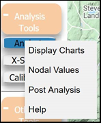
Figure 25: Buttons to access to show the cross-section and other chart analyses.
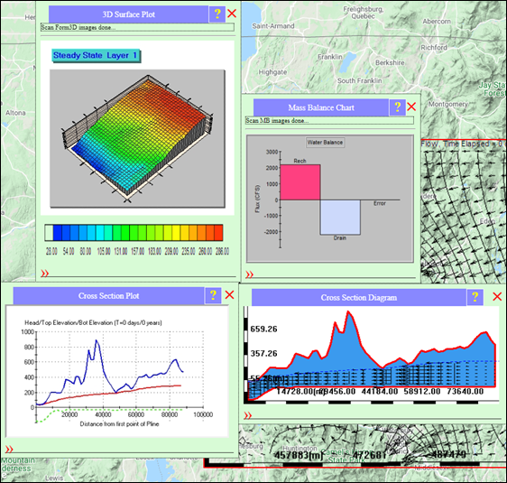
Figure 26: Different cross sections automatically created in selecting a cross section.
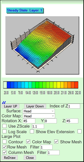
Figure 27: Demonstration of pop-up window generated when clicking the chevron.